Design Our ColdBlooded Banner!

Attention, MRC! We have an exciting opportunity for you to showcase your creativity and design skills. We are in need of a captivating banner image for our MorphMarket Reptile Community group on ColdBlooded. And who better to create it than one of our own?

So far we have just added a picture of one of Dubias cool MM stickers, but our community deserves better!

If you feel up to the task, lets see what you can put together :blush:

We can run a vote when we get a few entries.

7 Likes

I’m not artistic enough for this, but I feel like this picture is too good not to mention.

10 Likes

I second the first entry :joy: If anyone wants to incorporate it into a logo, feel free to use it.

6 Likes

What dimensions do you need the image to be to fit the banner?

4 Likes

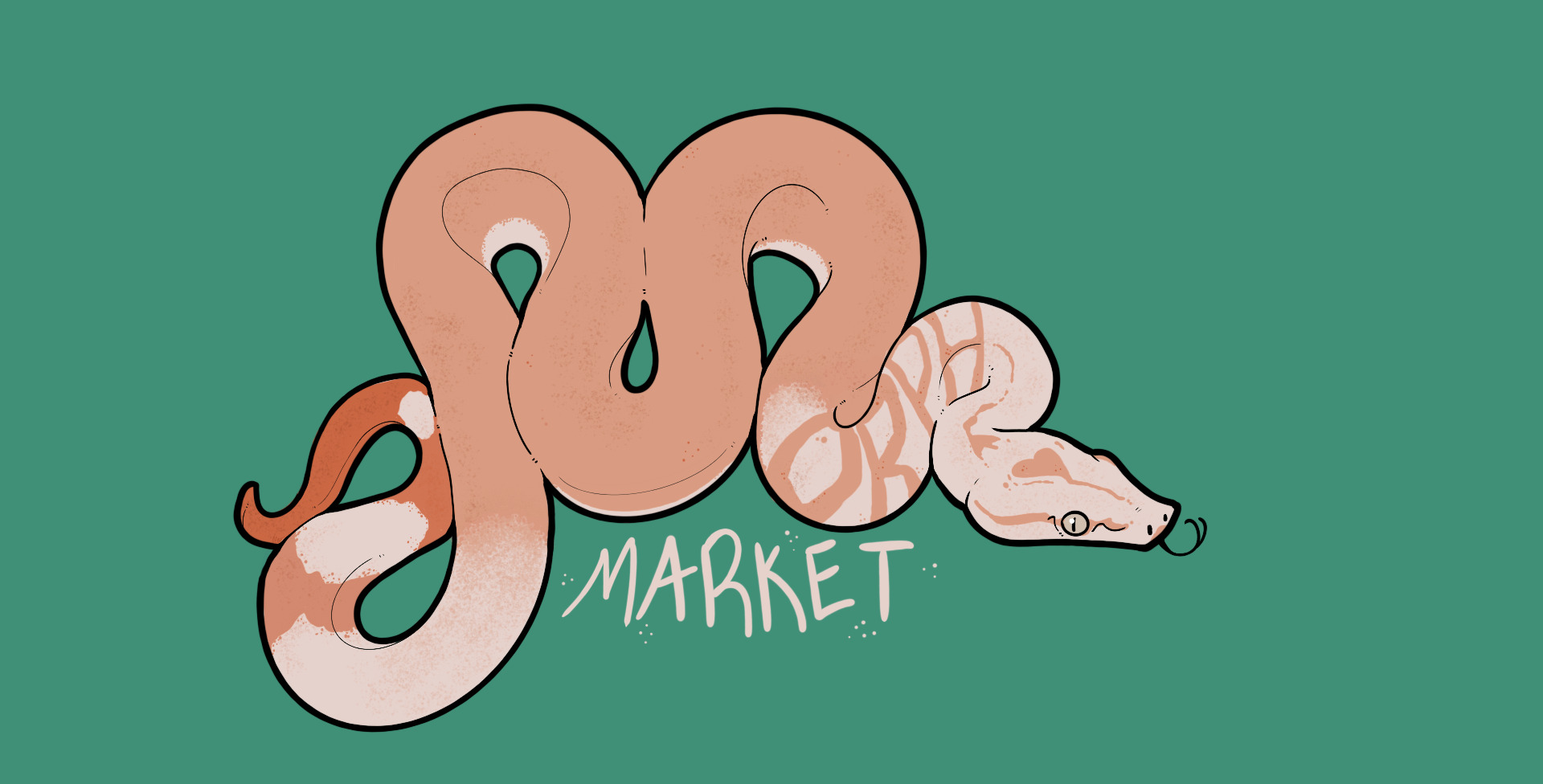
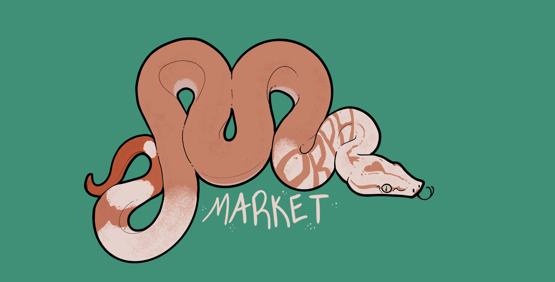
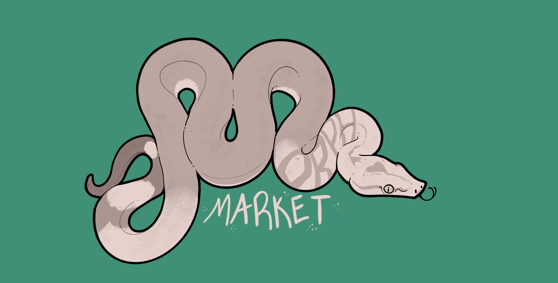
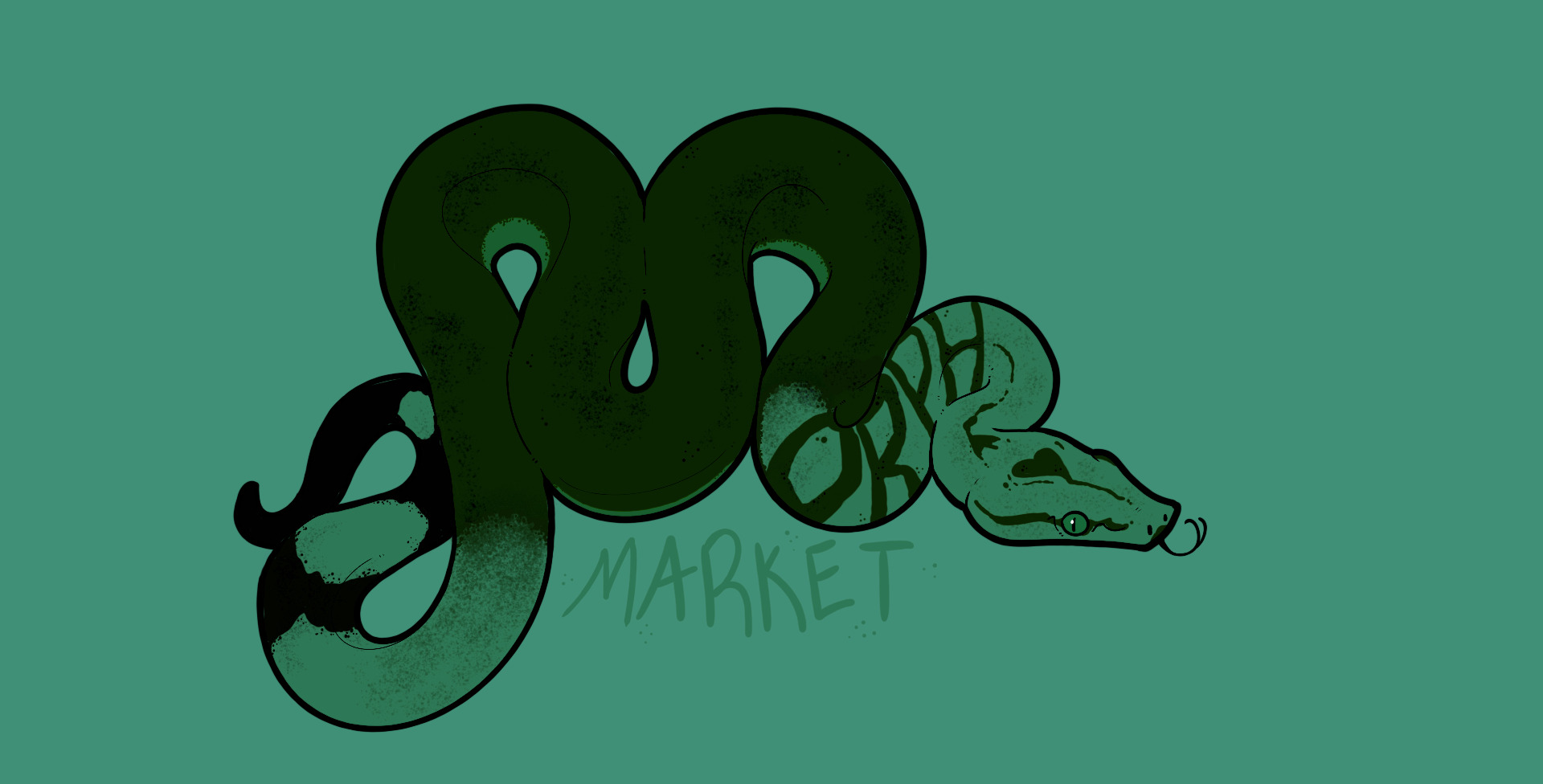
Here’s my entry, I can change it and resubmit once I know the exact dimensions you need.
I liked @mattcookreptiles photo too much to not have it be the basis for it.

Easy changes based on what other people think/want include:

  • background color
  • eye color
  • remove tongue
  • make ‘Market’ actual text font

I’d also be happy to re-do the whole thing with a different color scheme/morph, but that would obviously take more time than the other changes

9 Likes

This is amazing. Seriously good work!

7 Likes

omg i love this so much. Those colors are great and of course it’s even better because it’s a boa :joy: And it’s pattern spells “morph” :heart_eyes:

5 Likes

I made it a little darker to see the words better


7 Likes

Love those edits! I can also see if I can try a different color scheme/morph (ish) thing to make it a little more defined as well

3 Likes

Okay here are some base edits on my end that can make the words a little more visible:

  1. Slightly more saturated:
  2. Very saturated with gray bkg:
  3. And very contrasting: (love this one!)
  4. Probably my favorite!

    and #4 with the green bkg for some color theory

#3 and #4 are the best edits to color IMO, but I will mess around with a morph that’s more contrasted at baseline if I can

And a few that look GREAT on their own but might not be exactly logo material:


4 Likes

I like 1, 3 and 4!!

2 Likes

4 came out so spicy! Love doing quick color saturation changes on work I’ve done, you can get some real surprises!

2 Likes

I will say i’m definitely biased towards #1 because it’s some of my favorite colors and favorite color combination :joy:

1 Like

I absolutely love those softer colors too, I just want to make sure the words are visible, which is a tricky line to balance on

2 Likes

Okay last one from me :slight_smile:

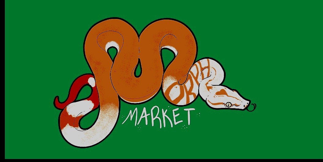
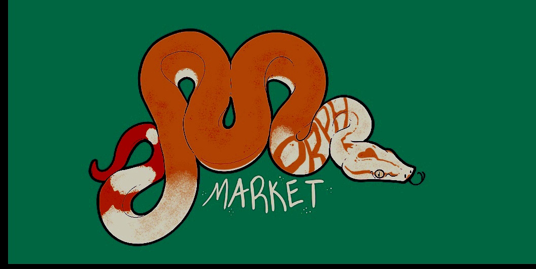
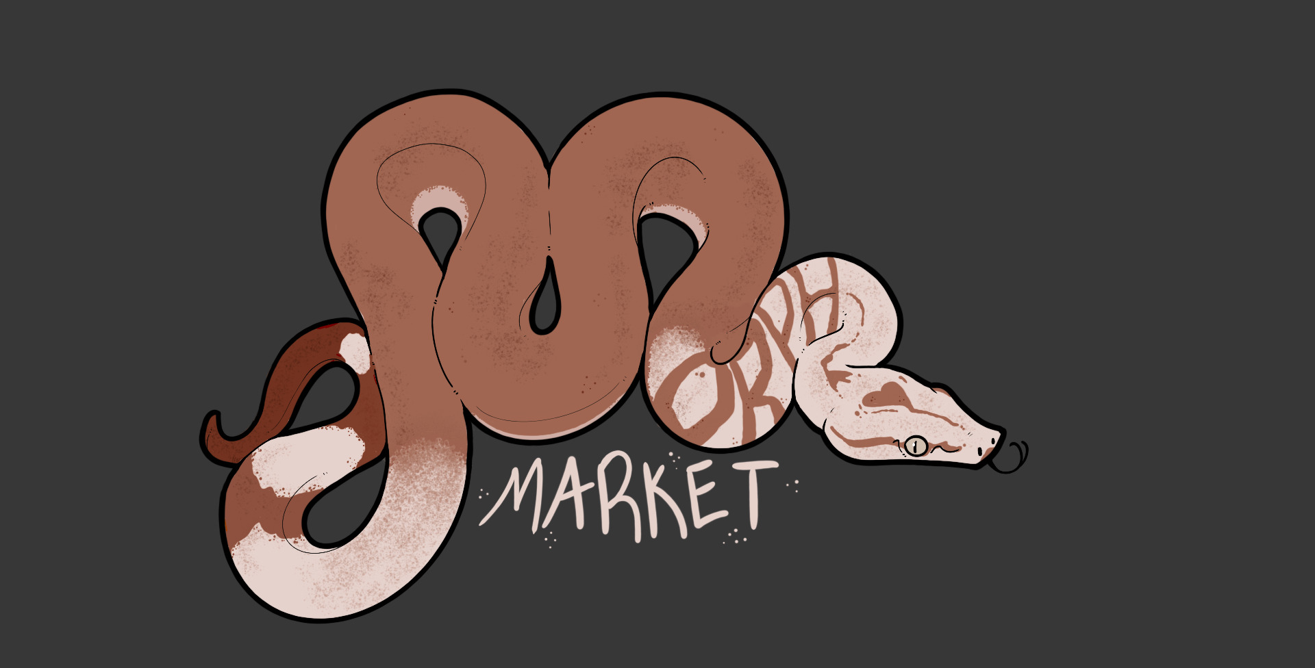
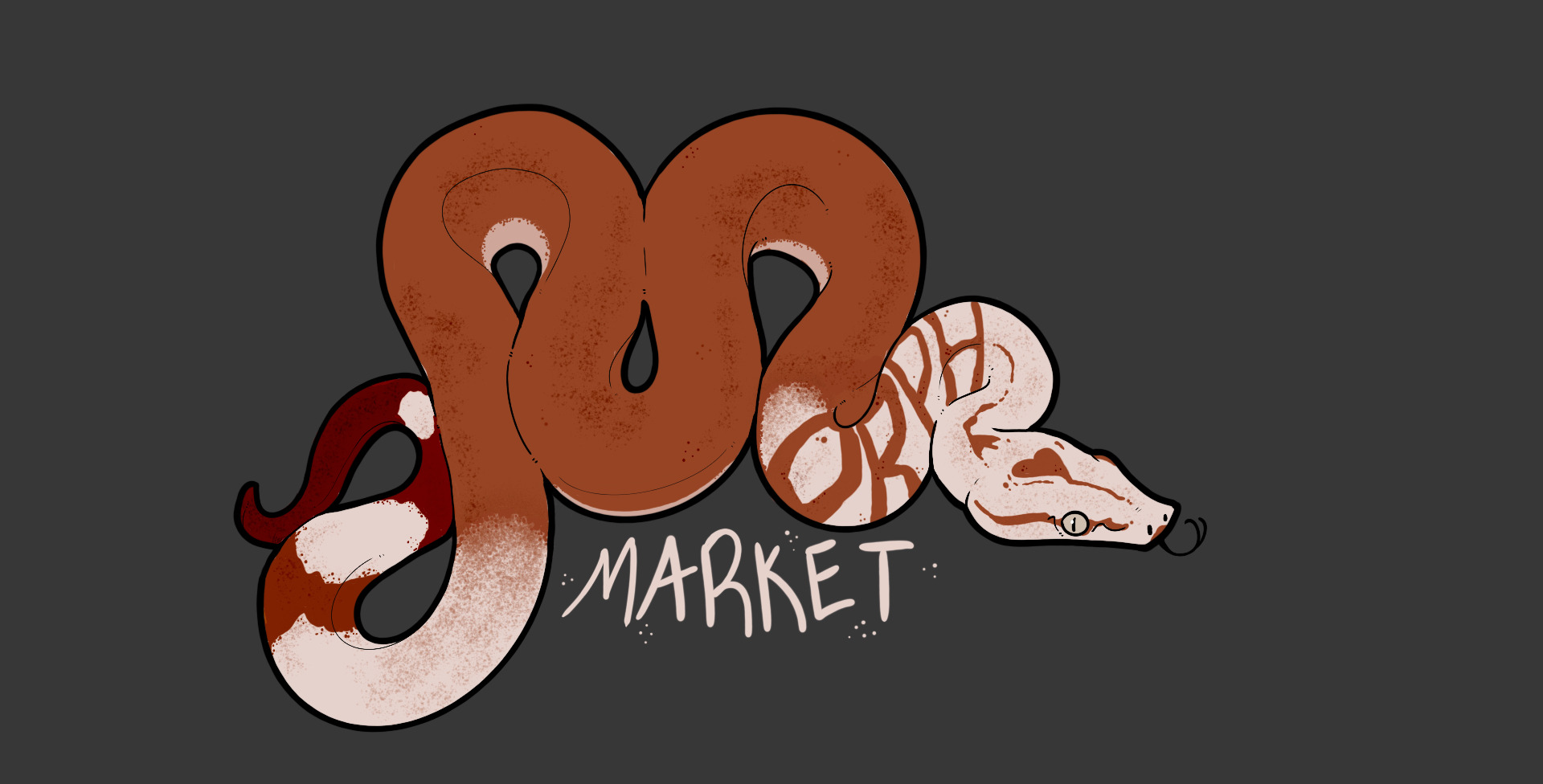
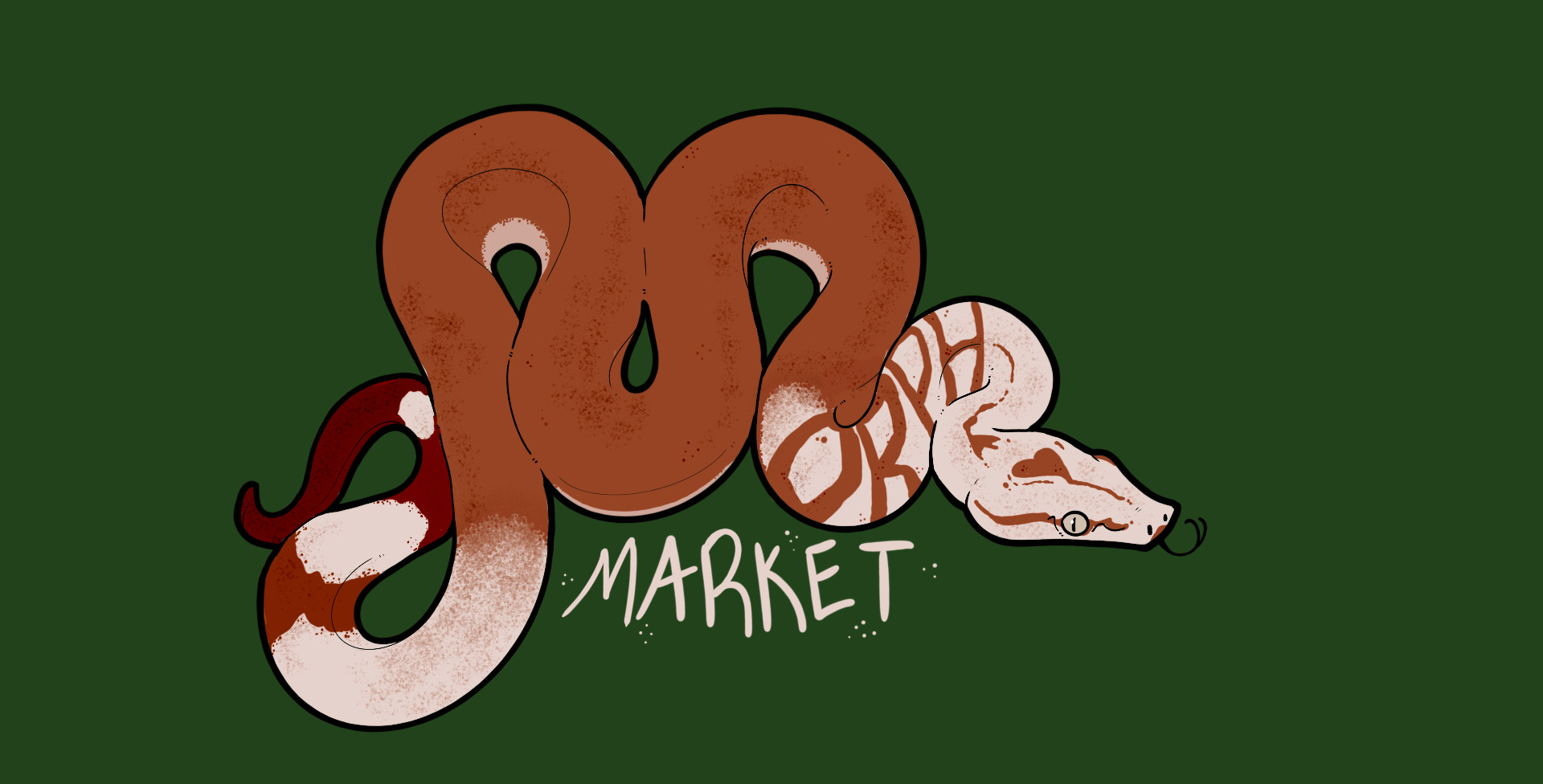
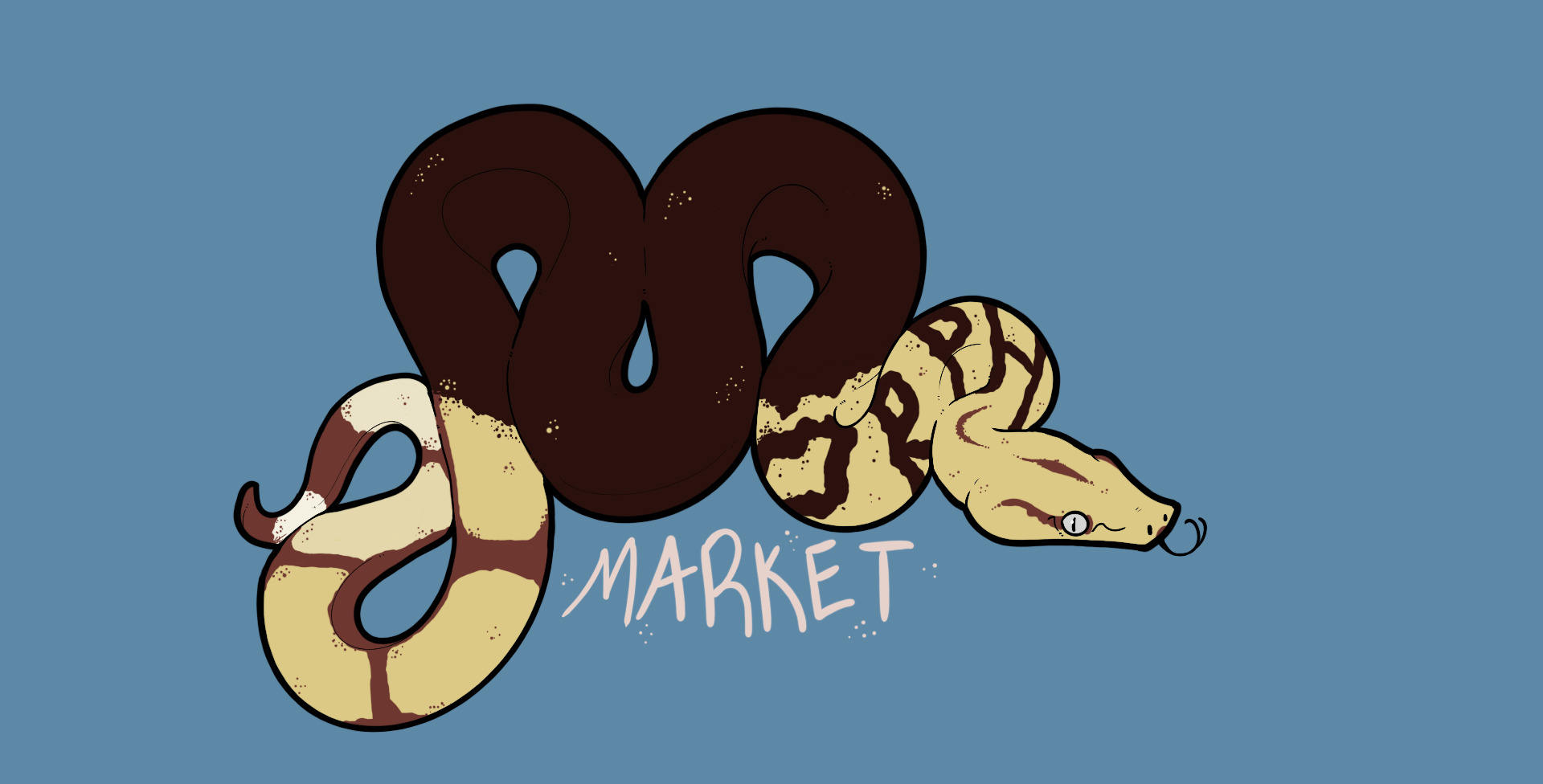
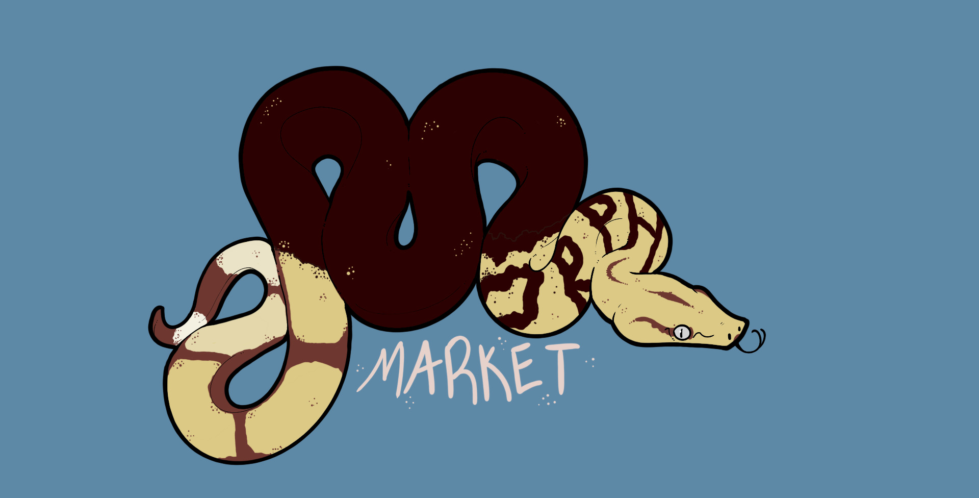
Started over and did a yellow FLRT (ish) inspired one instead. I still like #4 from the prior set better, but the natural color contrast here makes the wording a bit more bold. (Tiny color adjustments between the two)

Thanks for looking!


5 Likes

These are incredible!! I think number 1 is my favourite, but I wouldn’t have known that without seeing the rest.

Really amazing work @cmills

4 Likes

Can you make the giant M look like an M with this kind of back stripe?


5 Likes

Thank you!!

3 Likes

Yep I totally can try, it just might take a bit since I’m stuck in meetings all day :sob:

4 Likes