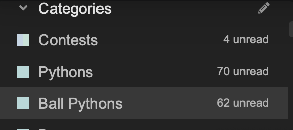
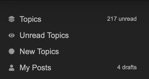
No longer seeing a “new”, “unread”, etc category. Just a drop down on categories that doesn’t work when I click. Anyone else?
@eaglereptiles
No longer seeing a “new”, “unread”, etc category. Just a drop down on categories that doesn’t work when I click. Anyone else?
Also seems the navigation bar at the bottom of the page is no longer present, it’s disappeared…. Am i going crazy or is anyone else having issues?
I am not having the drop down problem but I too have lost the nav button at the bottom of the page……
Nathan, you’re not crazy. I’m seeing what you are seeing
What theme are you using?
Can you switch it to a different theme so you can use the site? If so, please do and we will begin to work on this @nswilkerson1
@eaglereptiles and @brittni-admin this is for you.
Ok thank you, we will get this fixed soon Nathan
There was just an update to the nav bars code in GitHub yesterday … this is not something we have done ![]()
Lets see what we can do to fix it…
Hopefully we can get it back. I enjoyed it.
What about the bar at the top? It’s changed since yesterday, but I still don’t see an “unread” tab that was the way I always checked what new posts had been made. Assuming that was part of a coding update too?
I made a post about it yesterday, too. It happened at the same time the navigation bar got a coding update. I think @eaglereptiles is looking into it
Yeah It looks like there was an update to a few components at the same time so I have had to dig to work out how and why.
The nav bar I have no immediate fix or replacement for, but the Latest, Categories and Top tags are back using a temporary, older, component.
I have added a count to the sidebar to help relieve the lack of “unread” tab until I can get this fixed properly. This is melting my brain though ![]()

Right, this is a decent fix that comes with pros and cons. I have added New and Unread to the sidebar

Pros:
Cons:
This works for me, I seem to be having a weird issue here though. When I go to the side bar and click on “new posts” or “unread posts” for instance, and then I try to click the morphmarket logo in the top to go to the home page. It’s default to that “section” of posts I was looking at.
There’s a dropdown arrow on the tab at the top of the screenshot below, but it isn’t functional.
Also now appears there isn’t a good way to get back to this page
yeah, expect some really weird UI for the next 20 mins hour while I play around ![]()
Can you change dark mode back to how it was? Pretty please?
can you refresh and see if that’s better?
Yep, seem to be back to how it was
I have whipped (I say that like I haven’t spent half a day on this thing ![]() ) up a new and very “icky” nav bar. The old one seems officially dead
) up a new and very “icky” nav bar. The old one seems officially dead ![]()
The good side is I learnt a lot and this is completely custom. The bad side is we will likely come across some bugs that make me need to learn more.
<!DOCTYPE html>
<html lang="en">
<head>
  <meta charset="UTF-8">
  <meta name="viewport" content="width=device-width, initial-scale=1.0">
  <!-- Include Font Awesome CSS -->
  <link rel="stylesheet" href="https://cdnjs.cloudflare.com/ajax/libs/font-awesome/6.0.0/css/all.min.css">
  <style>
    body {
      display: flex;
      flex-direction: column;
      justify-content: space-between;
      align-items: center;
      min-height: 100vh;
      margin: 0;
    }

    /* Styling for the bottom navigation bar */
    .bottom-navigation {
      display: flex;
      justify-content: space-around;
      align-items: center;
      width: 100%;
      height: 50px; /* Adjust the height as needed */
      position: fixed;
      bottom: 0;
      background-color: #333;
      color: white;
      transition: transform 0.3s ease-in-out;
      transform: translateY(0);
      z-index: 1001; /* Increase the z-index value, which places this above other layers/items on the page.*/
    }

    /* Styling for each navigation item */
    .bottom-navigation a {
      text-decoration: none;
      color: white;
      display: flex;
      flex-direction: column;
      align-items: center;
      padding: 10px; /* Adjust the padding as needed */
    }

    /* Increase the size of the icons */
    .bottom-navigation a I {
      font-size: 24px; /* Adjust the font-size as needed */
    }
  </style>
</head>
<body>


<!-- Font Awesome icons, which you can find here: https://fontawesome.com/search?o=r&m=free -->
<div class="bottom-navigation" id="bottomNavigation">
  <!-- Example: Change the 1st link and icon -->
  <a href="https://community.morphmarket.com/">
    <i class="fas fa-home"></i> <!-- Font Awesome icon for home -->
  </a>

  <!-- Example: Change the 2nd link and icon -->
  <a href="https://www.morphmarket.com/animals/">
    <i class="fas fa-frog"></i> <!-- Font Awesome icon for frog -->
  </a>

  <!-- Example: Change the 3rd link and icon -->
  <a href="https://community.morphmarket.com/new-topic">
    <i class="fas fa-plus"></i> <!-- Font Awesome icon for plus -->
  </a>

  <!-- Example: Change the 4th link and icon -->
  <a href="https://community.morphmarket.com/categories">
    <i class="fas fa-list"></i> <!-- Font Awesome icon for list -->
  </a>

  <!-- Example: Change the 5th link and icon -->
  <a href="https://community.morphmarket.com/tag/portfolio">
    <i class="fas fa-images"></i> <!-- Font Awesome icon for images -->
  </a>
</div>

<!-- Part that handles the scroll behavior -->
<script>
  let prevScrollPos = window.pageYOffset;

  window.onscroll = function() {
    let currentScrollPos = window.pageYOffset;

    if (prevScrollPos > currentScrollPos) {
      document.getElementById("bottomNavigation").style.transform = "translateY(0)";
    } else {
      document.getElementById("bottomNavigation").style.transform = "translateY(100%)";
    }

    prevScrollPos = currentScrollPos;
  }
</script>

</body>
</html>