We are about to begin redesigning the MorphMarket marketplace website to improve its usability and we’d like your input.
This topic is not for new feature requests (create a new topic for that). It’s for identifying the aspects on the site that are a little confusing – especially to new users – and could use more thought in how they are displayed or function. Could be anything from how the navigation works to something you always forget how to do or how to find. Or maybe something that still irritates you such as a button that’s too small on mobile.
If you’ve been a user for a long while, your best ideas would likely come from “reaching way back” in your memory to when you were a neophyte user just trying to figure out how things worked. But only suggest it if it was really a problem for you, not something you suspect others have issues with.
I can’t promise we’ll use your idea but it will definitely be considered. I will be personally working with a designer and including all the feedback we’ve received over the years.
To keep things more compact, if someone mentions an idea that you want to vote for please “like” it; no need to add another post.
Please don’t ask for an app. Instead, mention specific pages which are hard to use on your mobile device.
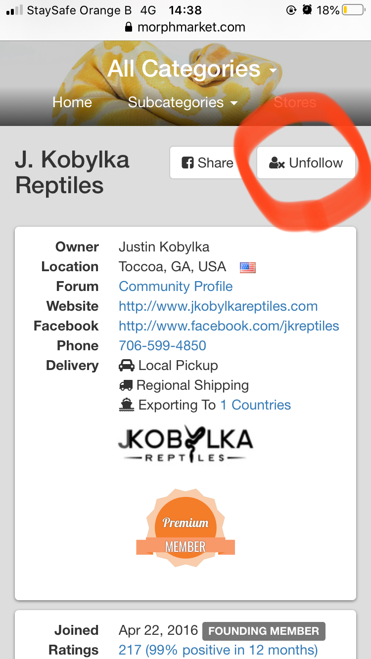
One thing that came to mind was that it’s a bit difficult for me to find my own storefront on MorphMarket. I have to go through odd steps to get there, rather than it being easy to access on the front page.
Perhaps adding a “My Storefront” option in the drop down menu, or something along those lines? This would link directly to the users’ marketplace store (if they are a seller), which would make it easier to find and copy the link for adding to websites or social media, or to send it to people.
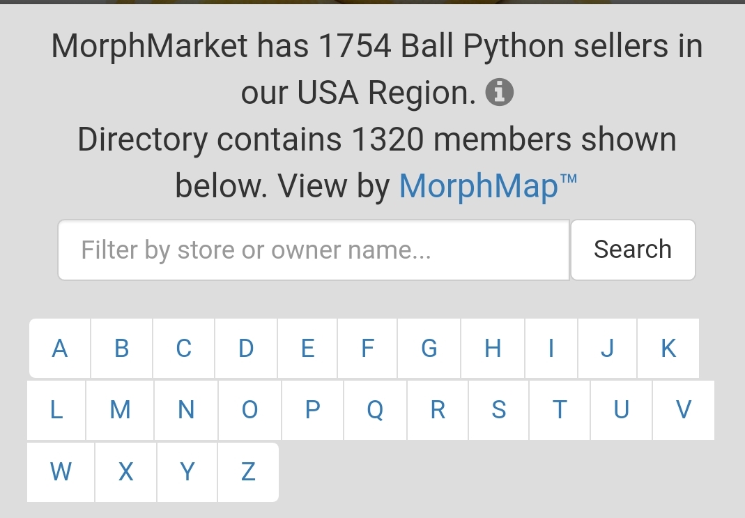
Haven’t read through the comments yet but rather than having to scroll through all the stores by alphabetical order what if you could just search up the name if you already know it? sort of like how the filter gives suggestions when you try inputting a morph.
yes somewhat answers my question but I mean in the actual filter bar. Just like how I could look up a leopard BP for example it’d be nice to just be able to type in a store name rather than having to scroll through the very extensive list of sellers. Not sure if I am making sense, not the best at conveying my ideas at times.
Really? has never showed up for me. Just checked and it is not allowing me to do that, all I see is just the list and it wont allow me to type a store name that way. I don’t know why its never let me do that. I don’t know whether to feel dumb or angry at my phone lol.
I think I get what @nathan_e is asking for. He wishes that the stores page have search functionality that autocompletes like we now do in the ad search filters. It’s a good idea and easy to add.
Is there a way to follow or keep track of breeders that you’ve purchased from? I try to send pictures as she’s growing to him and he seems to enjoy that he gets to see her grow up
It does not already show that on your end? When I look at a sellers reviews it will show part of the buyers username but not entirely so I would have thought that as the seller you could know who it was.
We have something like this in the pipeline but not quite it’s own section. You will be able to save certain species/combos and be alerted if they get listed… Wanted Section aka In Search Of Alerts