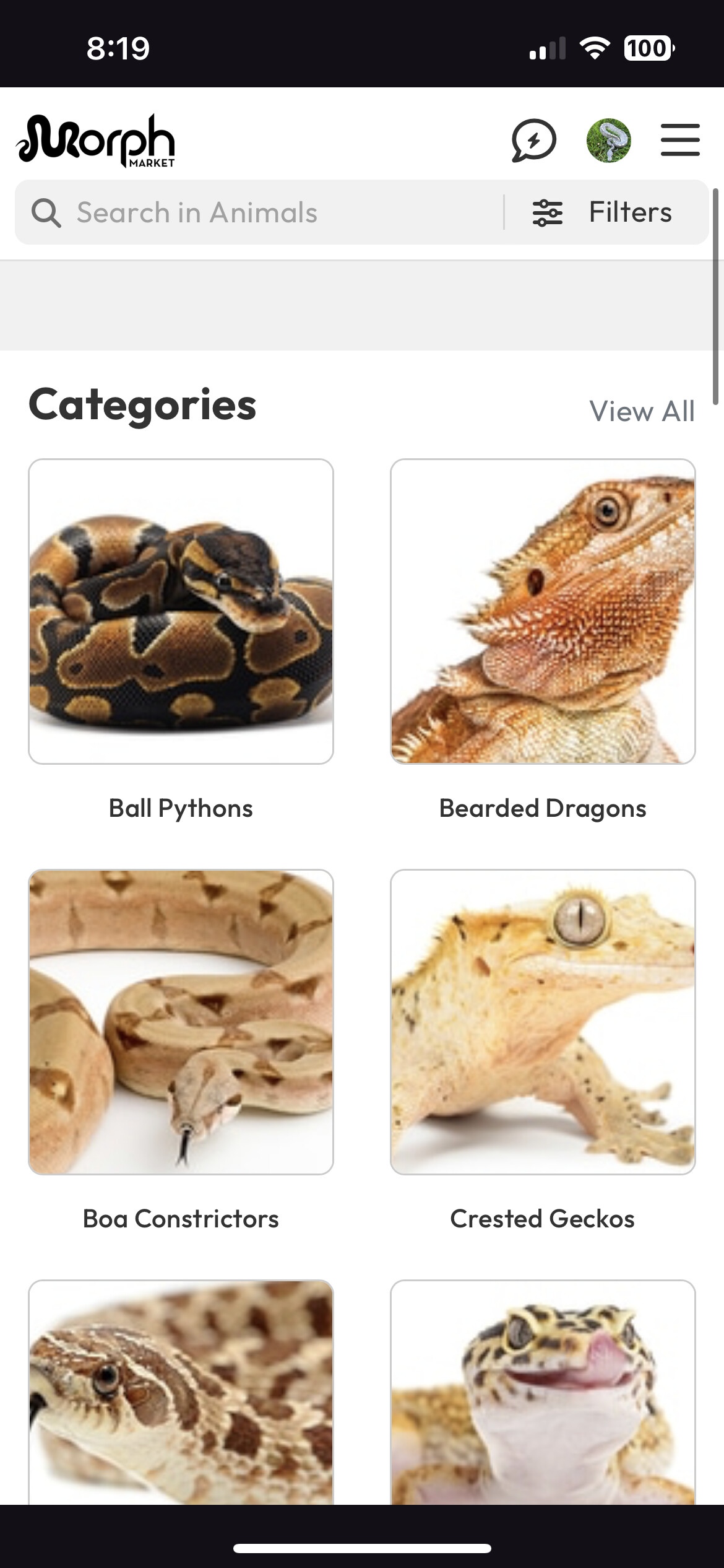
Seems the frames for the categories have become jumbo size, and are no longer sorted/listed by the ones we view most often?
My layout used to be ball pythons then Garg geckos and hognoses, which is the order of popularity I’d view them. I never look at beardies or boas really. Can individuals pick whether they want massive icons or small ones? These seem…. Slightly childish? They just don’t really fit well design wise.
I hadn’t been on morphmarket yet today until I saw this and I agree that it does look almost childish. at least make the pictures fit to the boxes if this is how it is going to be
Also, it looks like the messaging window has an issue with appearance. It seems it wants to have the home bar/button navigation bar/whatever you want to call it, it it doesn’t.
Sorry to be a bother @eaglereptiles , but do you know if there is any intent to try to bring back the button/action bar across the bottom of the page on the app?