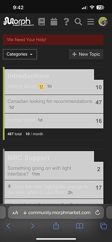
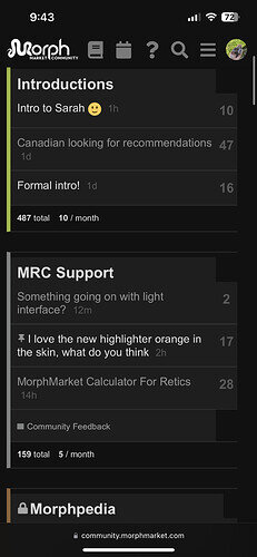
The light interface is showing up different than usual, with letter fonts almost melding in with the background. Don’t know if this is a temporary bug. I use a PC, not the app. If it’s not a bug, I guess I’m just not a fan of that interface ![]()
@eaglereptiles i’m tagging you so you see this.
Maybe just darkening font color would do the trick.
Seems there’s an issue with the standard dark layout and the light layout. Here’s some screenshots to show the issue I’m assuming @crestie-lover is referring to.
I’d like to note - if I change to any of the “new” dark themes, those blocky boxes go away. But if I use the “MRC dark” theme; that’s what is present.
Yes, you’re right on. I can barely see the words, they’re too light.
As you can see on screenshot 1, the light words (which I believe are topics you haven’t viewed) you can hardly see.
Yes, that’s correct. They’re almost white on a white/light background.
Ok, I see what you’re seeing. I am sure that Thomas will look into how to make the themes and the new color schemes work coherently.
This is a testing colour scheme for a completely new theme… I’ll turn that one off for now so it cant be selected. Nice catch!
Sounds good! That light theme was just not working I guess.

