No worries 
Your logo is a real piece of artwork.
No worries 
Your logo is a real piece of artwork.
That is absolutely brilliant  .
.
I really need to see King Kong style “Hognose in Paris” movie now  .
.
I finally just got the logo I wanted (cause I’m super in love with it now) and several artist later…
First it was these three:
Then wanted something that looked more business professional / adulty

^ repped this for awhile but I knew it wasn’t me or how I wanted to express myself
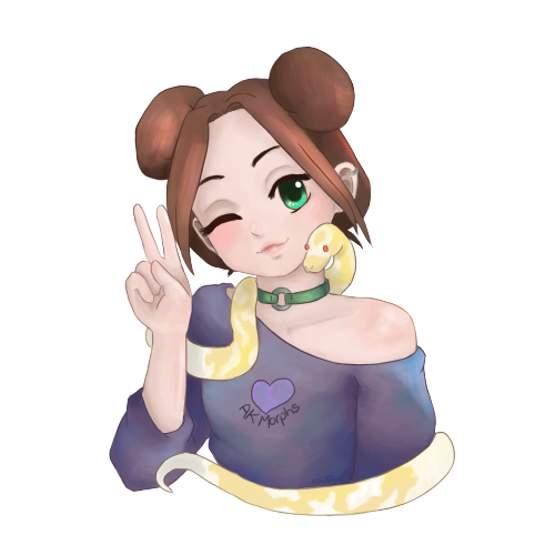
So I commissioned this and I LOVE IT and can make cute stickers with it

I let the artist choose what ball python they liked most so the albino was a massive surprise
Overall I think this one shows the type of person I am, and what people can expect.
Plus, it’s super kawaii >.<
This is my current logo, drawn by me.
I think it should be pretty easy to transfer as a silhouette design on like tshirts and the sort
This one!!! I really like!
I still need to get one done, and I find the entire thing somewhat daunting. 

Good evening,
I’m not selling, nor do I have anything to sell just now, but taking all of this good advice to heart I am working on a store and logo…

I changed my username to Toadhall, well everywhere but here, I couldn’t figure out if one’s forum user name could be changed. Put together a logo… I am starting on a web page next.
Could anyone who’s interested please take a look and tell me how I am doing?
Just click on your profile picture then click on your name at the top above the feed. Under preferences you can change personal information like your name. @xamier nevermind you can’t change the username just your name
Love the new logo! I am sure that you are vey proud of it as you should be!
Ya I am very. And for just starting out we did well our first year. Now on to more amazing stuff in the new year !
Here is my first stab at creating my logo. Please be brutally honest on what you think, would love some feedback.

I really really like it.
It is personal, clean, shows a glimpse of what your about  .
.
While I’m here, here is a sneak peek at my Christmas Logo  …
…
I dig it!!!
How do y’all draw up your logos? I have an idea in my head and I CANNOT draw but I can mess with computer software if there is something you guys can suggest. I’ve also asked all my artist friends over the past six months or so and I’m still waiting… so I’m going with I’m gonna do it myself.
Edit: I also offered to pay them lol
I use a app on my phone called Autodesk , it is free and loaded with features. I’m not sure if it is available outside of the Play Store but if so then it’s definitely worth giving a go.
Sweet!! I’ll try it when I get home!!! EXCITING!!!
Yeah, there are a bunch of free to use apps out there for logo design. Try a few out before paying anyone. Most of them are pretty good!
Thanks all for the feedback.
Love the Christmas logo! Never thought about adjusting logos seasonally to attract attention. Nice work!
Hi everyone, I am just getting started, and getting my ducks in a row. A big milestone arrived last night: The Logo!!
Here it is. Let me know your opinions. Go easy on me… ; )
(Mods, I think I recall a thread of just logos, but I could not find it. Merge where appropriate if need be.)
Congrats! I really like the concept. If you’re looking for on the design the one big issue is that it isn’t easy to decipher at a quick glance. You need to look pretty closely to figure out what’s going on and differentiate the snake from the banner. Probably the easiest way would be to fill the snake with some color. If you want to keep it black and white I suggest starting with removing the ‘spatter’ texture from the banner. If you are willing to have some re-drawing done some adjustment on the head and tail positions could help a lot with quick recognition. I like the idea of the tail wrapping the end of the banner but having them cross feels too busy. I’d probably have the tail end with gentle curve under the R. Lifting the head so that it has a similar arc to the other curve of the body on the top of the body will give some space and make the shape of the head easier to recognize.
On a personal opinion level I’m not loving the pixilation texture on the snake. I get that it’s going for the look of scale but…meh. Though it might be that it’s just the clash with the spatter texture and if that’s gone it’ll look less pattern clashing.
And, again this is personal, would like the snake to be a lot thicker. If you are selling/specializing in royals the snake in your logo should have a snake that looks like a healthy royal. The head shape and pattern are great but I can’t imagine even a starving royal could have that length/girth ratio. If you thicken it up you may need to take out a loop, but that would probably de-clutter the middle, which I don’t think would hurt the design. Hope that was helpful and not too much. Overall I think it’s a solid concept with a lot of potential to be really well done.