Hey so im trying to come up with a name and logo for my ball python breeding. What i have come up with is the name McK Morphs. This is the logo I kinda worked out. Let me know what you guys think please.
PS THE BOX IS NOT PART OF IT. The image border will be deleted.
Honest opinion, well while the name tell me it about reptiles mutations, the logo does not, whether it is to snake people or none snake people.
I think the name or logo should give a clear idea of what you are about as a company, and when I look at your logo, I do not get that.
The idea with the tree has more to do with the celtic background and life. Also snakes may not be the only morphs we deal with in the future, as well as any other things we get into. Possibly racks and custom enclosures. My fiance is a licensed cosmetologist. So she can morph people. Lol.
I can understand incorporating personal things such as ethnic background, I know have, I am french and my logo reflects that with the fleur de lys however if you look at my logo it’s still means reptiles whether you are a reptile person or not which is what I was trying to get at.
When I think logo it should give an idea of what people are about something people can remember and if you are into the reptile industry (enclosures or reptiles it should really reflects that IMO)
This is my logo now 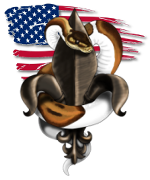 which reflects my type of business (snake breeder) but also ethnic backgrounds (fleur de lys because I am french) and the American flag because I call the US home since 2001. So all very personal things that makes my identity.
Maybe you could make the green circle around the tree a snake that might help. Also I’m not sure I like the color and font of the McK, I like the idea of the tree though it looks really cool!
Oh yes, much much better! I really like that!
It definitely says snakes even to non reptile people so definitely an improvement, and still allows you to keep other thing in your logo that are personal to you.
The MCK are far away from the whole snake and tree thing, the squares and circles are just a lot going on, the snake looks as though it’s about to eat the ball and the overall design looks very blocky and not smooth.
Ty for the input. It is blocky. These are just rough ideas. Whatever we decide on will be finessed.
Here is a picture with my logo in the bottom trust me this is about the 2000th revision before i actually liked what i was getting and now im considering starting the logo all over again because this logo is extremely hard to recreate in decals screen printing and embroidery so its back to the drawing board
Uploading: LSD EXOTIX.jpg… this is how we had our new logo done.
Your links are not showing up too well @lsdexotix
If you leave the line above and below your link blank, your image will appear in your comment instead of being a link.
As a example:
(Leave this line empty)
Image
(Leave this line empty)
here you go:
Here is my Logo (I still need to make a high quality copy for larger versions):
And here is what I originally drew up:
I made it on Autodesk drawing tool (it’s basically a free version of Photoshop but with a few less tools)
I wanted something clean and simple, with the main thing that you notice being my name.
Also, take into account what @jdavis2029 said about reproducing your logo in physical form.
I love the deeper meaning of your logo! Very personal and the logo looks awsome all around!
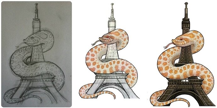
Thanks to me it has to be very personal and reflect who I am. I have another one as well which is a hognose wrapped around the Eiffel Tower 
May I ask what program you used to create your awsome logo? Would love to make something awsome and original like yours
Actually both my logo were commissioned by two different artista which actually reached out to me.
This was the first rough sketch 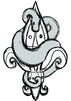
This is the other logo
Beutiful! Well hopefully I can get a awsome one made for me too
