one thing to add please make sure to get GROWN UP sizes too lol i’m a bigger guy and most places don’t get shirts bigger then 1 or 2 x. Just a small request for those larger then life among us.
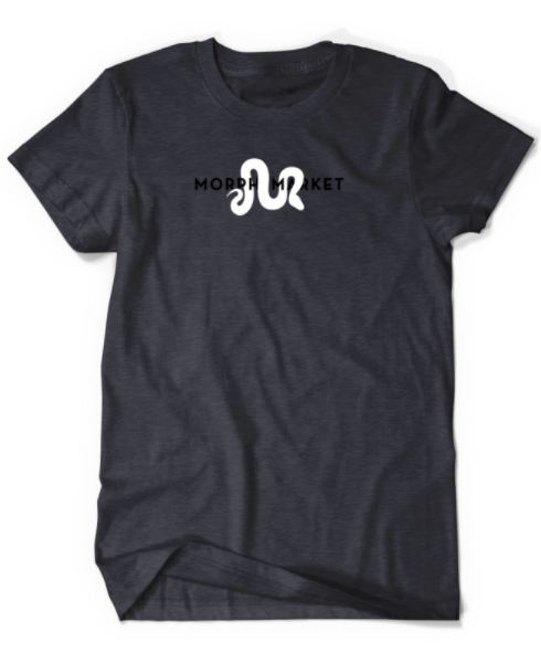
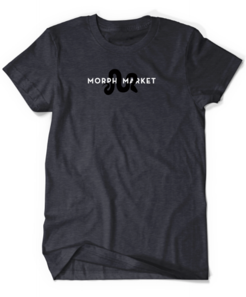
I personally like option C the most just because the shirt is already fairly dark so the white lettering with the black snake makes it pop more than the others. They all look great but just thought I would share which I liked most. Thank you for all the time and effort you put into everything! It really does show.
I feel like it would look better if the shirt color was a little lighter, or if there were some kind of border or background for the letters. The black blends into the shirt a little too well and makes it hard to see the text on the first two. The last one kinda solves it by changing the text color, but if the shirt were lighter the whole logo would stand out more.
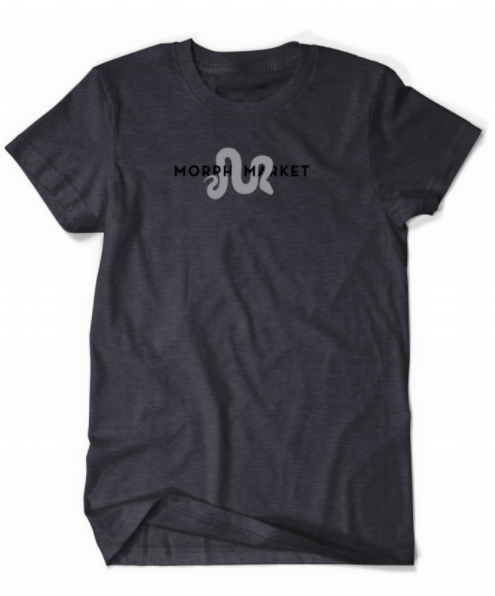
I chose A because I prefer the subtle coloration of the snake. I really don’t care for the high contrast of B at all. However, I was torn between A and C, and now if I could change my vote to C, I would, simply because the text is easier to read on that one.
Edited to add that I just realized I could change my vote, so I changed it to C. I still think the gray snake looks nicer, but the dark letters get lost on the shirt.
I chose C because it has the best visibility in terms of text.
Black on black isn’t really the best design choice imo. It’d probably be better to use a white shirt, or use white borders on the dark bits of the design (like a white border around the black text)
Personally I love C and this is due to the fact that the juxtaposition between the white lettering and the black snake even against the dark gray shirt make the pattern and words more visible. Again another way I find it very important that I’m able to read what I’m representing. Love the community and Morph Market, so I would want a shirt that is easier to read so that it speaks for itself.
Here’s an explanation. @macabremoose hit the nail on the head as to the idea of design of A & B and why they were not more readable – the key word was subtle.
Consider alternatives:
The full logo – this is maximally clear. And for our biggest fans this might even be the favorite, I am going to run another vote to see how it compares. But other people might enjoy something that isn’t a “walking billboard” as much, hence the other ideas.
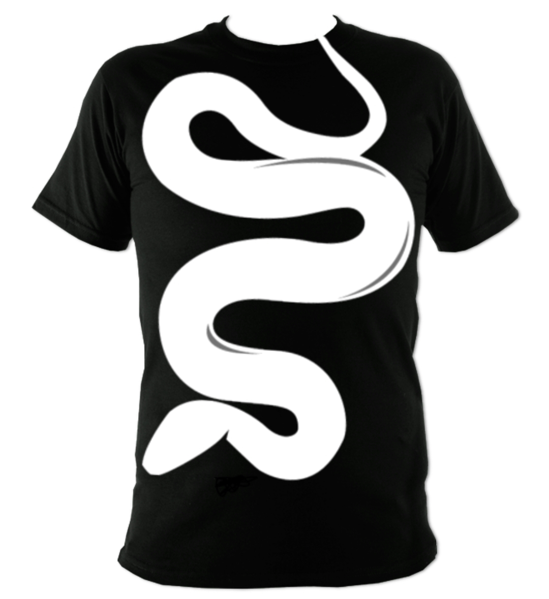
Just the M by itself. It’s a cool design (slightly updated too), and intriguing, promotes conversation.
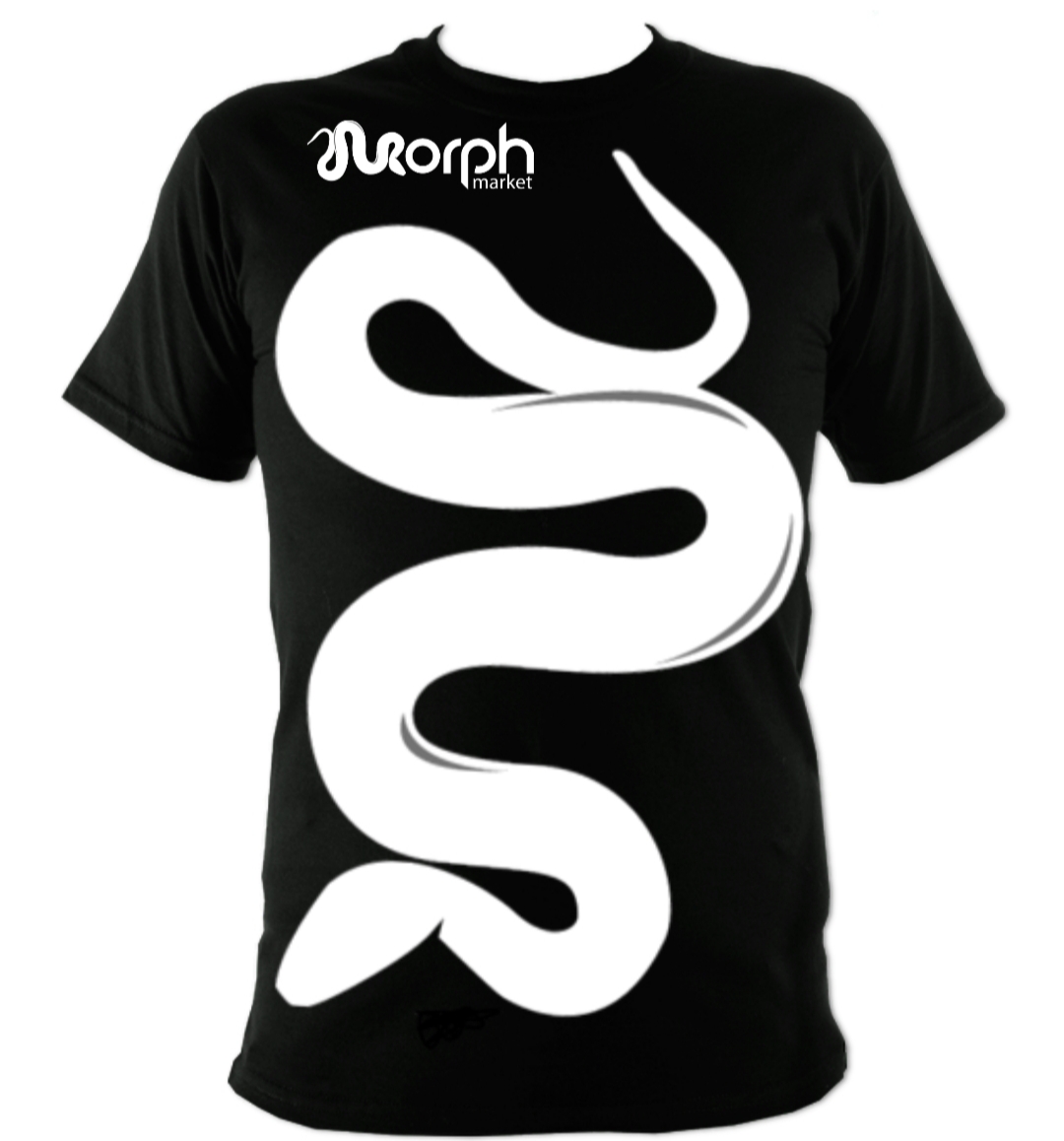
The M1 designs above are a middle ground, running the word “morph market” through it but not necessarily in high visibility. The goal isn’t to be able to read that from across the room.
There isn’t a right or wrong answer, clearly, but in soliciting feedback I imagine that some people reacted to the “obvious” problem that the words weren’t readable (I could see myself doing that too), however, maximal readability isn’t the only goal. That being said, I understand people preferring the readable version too.
Thanks for everyone’s feedback! If the shirts sell well, whatever we settle on, I plan to have multiple versions.
I wish we could stock all versions of the above… however, it becomes hard logistically because if we carry 10 sizes as some people want, then having 2 variations doubles the number of things to keep in stock. That being said, we might have all sizes in one and limited sizes in another.
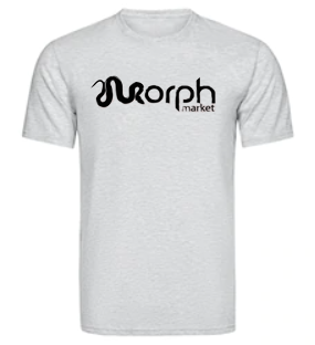
Personally, I like the full logo. I went ahead and photoshopped this the other day:
Since the logo is only one color on this version it’s easy to create contrast between the logo and the shirt. It also solves the issue of the snake obscuring the text. If you’re dead set on a darker shirt you could just make the logo white or light grey.
The snake-shaped M would be a nice look on it’s own too. It’s just vague enough that people who are unfamiliar with MorphMarket may just see a snake, but people who are familiar with it should recognize it right away.
Yea, I came to realize that the the strong preference was the classic full logo over the M1 design. I took a poll and with over 100 responses, 85% preferred the classic logo.
Therefore we are going to start with that.
The goal is to have the merch shop online by Black Friday!