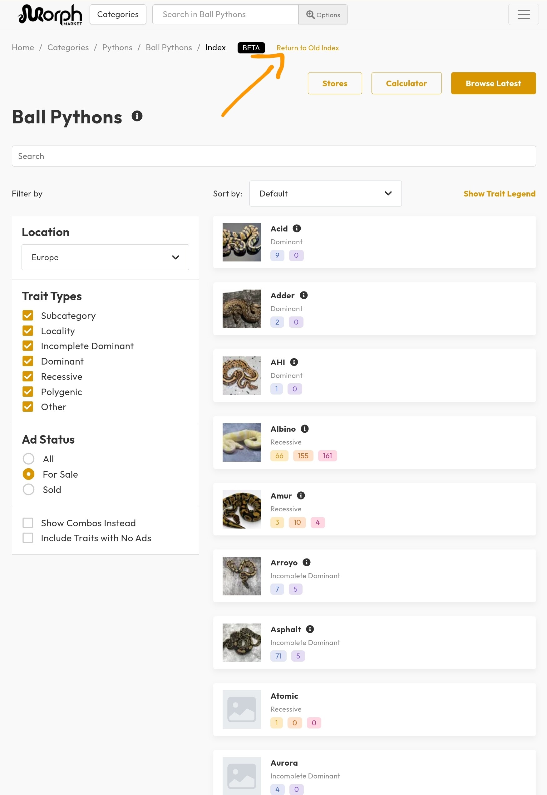
MorphMarket’s Index Page is where you can explore animals by trait, such as by gene or locality.
We’ve rolled out a new version as part of our platform redesign.
It does everything the old version did PLUS:
Search, filter & sort traits
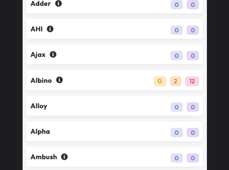
Photo thumbnails
Clear labeling of the type of trait such as it being a Locality
The ability to see ALL traits in the system even if no ads are listed
Trait combos list all the traits in the combo
And of course a fresh, professional look
The demo below shows these features.
Try it out by visiting any category from the home page. For example Ball Pythons.
To make requests for additions or changes to the listed traits, visit this page.
If there’s a problem with this new page, you can still switch back to the older version for a time using the link on that page. But please do give us feedback so we can make appropriate fixes as the old version won’t be around for much longer.
We understand that this is a different design, and it will take a little time to get used to given that this page has not changed in 7 years. But please give it a chance for a few days to understand the changes and improvements before dismissing it as “worse”. There are other website which haven’t changed in 30 years, but this site is going to continue evolving. We welcome feedback once you’ve taken a little time to understand it. In most cases, there are some very easy changes we can make to the new pages which address the issues. Thanks!
Way too much unnecessary information and spacing when on mobile. The old index is hands down better. I’m sure it looks great on a larger screen devices but I never use anything but a mobile phone for this site.
It is very busy on mobile. I find it difficult to navigate, but if more horizontal space was utilized and you didn’t have to scroll as much, I think that I would be a lot better.
My biggest gripe is that on mobile, its very cluttered and I have to click through several pages to get to what I’m looking for, whereas on the old version I can just scroll to the bottom without issue. The only thing I can tell was added is a picture of the morph itself which is causing most of the clutter since every category has to be resized to accomodate the picture. Why not simply add a scroll over mechanic to the old layout that shows these pictures when you tap/hover over it? That way you could keep the sleek, compact design of the old layout.
The new index is OK on the computer, not so much in the app. I can see it as an easy way for someone not familiar with various morphs to scroll through quickly and discover what they like. But the vast majority of users are breeders and the efficiency of the old design is quicker and easier to use. I personally don’t need a picture of various morphs to know what it looks like.
An update to the search function to allow more “and/or” options would be a better update, ie. Clown and albino or pied would give all results that are clown pied or clown albino, and this could be exponentially expanded. I for one would like a quick search that shows everything that is double recessive, or triple recessive or double recessive with a het, etc. Also, adding the long awaited option to receive notifications when a listing matching a user set criteria is posted.
How do i put it back to the old way? I really do not like this. I find it difficult to navigate and too much in my face. I like the list way better without all the other information and images.
I was just about to say, if there was a button let you use either version, i think its a huge improvement. Long time breeders and mobile users can select to use the old version, and potential buyers looking for something but not sure what yet, can look through the morph pictures to get an idea what each thing is instead of being overwhelmed with names.
Personally i use mobile, so i will be sticking with the old version, but it definitely was a neat update. I also noticed that some morphs are being risk labeled with assosiated defects, i think this will definitely help with customers who are suddenly upset they recieve a champaign / spider that has a wobble. Helps remove any excuse of not knowing what they are getting into
Yeah, this is my main complaint as well. I virtually always browse the marketplace on my phone, and having to click through multiple pages is definitely more annoying and cumbersome. I feel like it would be fine if it was all displayed on one page, but the multiple pages makes it a lot less user-friendly.
Eh, its alright. Take it or leave it…If youre on a mobile, seems like a lot of trouble to go thru if your looking for Zuwadi. Might have to switch to Acid.
I primarily use the site on mobile, and I also don’t like having to load multiple pages to see all the morphs. Switching from “available” to “sold” is also easier on the old design.
And while the picture icons may be helpful to some, they are too small to be useful for me and ruin what was a sleek design.
Wooooooo ! The old version is soooo much better. Definitely this is one thing that doesn’t need to be “fixed”. It is super clean and efficient in the “old” version. Even on my laptop it’s not a good experience. Please do not change this.
Agree w preferring the “older” version as I also use this 99% on mobile and the thumb nail pics aren’t any benefit to me, it seems better for very new people to the hobby/app. Then again I’m “old” myself and any change takes me awhile to appreciate. It’s good that there’s a tab to convert back to other version but that can’t stay forever, it doesn’t make sense from a programming standpoint carry both long-term.
Not really a fan of the new version. I tried to like use it and like it but there’s just to much information up front and the thumbnails are tiny which doesn’t do anything to get across what is being presented.
Old version might just be text with no pictures but it gets the point across very quickly and when I was a first time user I understood instantly what was what.
I noticed most people that have complaints mention that they are on mobile, but I myself primarily use PC to browse.
In summary: Simple, clean and streamlined is better.
An update is in the works – not yet released – which will address most of the feedback - providing a compact view like before, and with all results on a single page.